Luk Heung Commons
Collective Imagination of Neighbourhood
For over four decades following the 1960s, Luk Heung Public School echoed with the voices of local children—a testament to a village community's unwavering belief in education and a brighter future. When declining enrolments forced its closure in 2006, the historic campus fell quiet, putting decades of local memory on pause.
That pause ended when the space was reawakened with Luk Heung Commons, a community project by the Evangelical Lutheran Church Social Service-Hong Kong (ELCSS-HK) and Happy Ageing Lab, funded and supported by the Zeshan Foundation. The former village school, known as Luk Heung Campus, has become a warm, welcoming living room for the neighbourhood: a place where generations meet, swap stories, share resources, and shape their community together. To bring this participatory vision into the public eye, onebite was commissioned to design a complete visual identity and social media framework rooted in this spirit of togetherness.
-
Category: Storytelling & Communications
Type: Visual identity design
Client: Happy Ageing Lab
Completion: 2026
Doodling on History
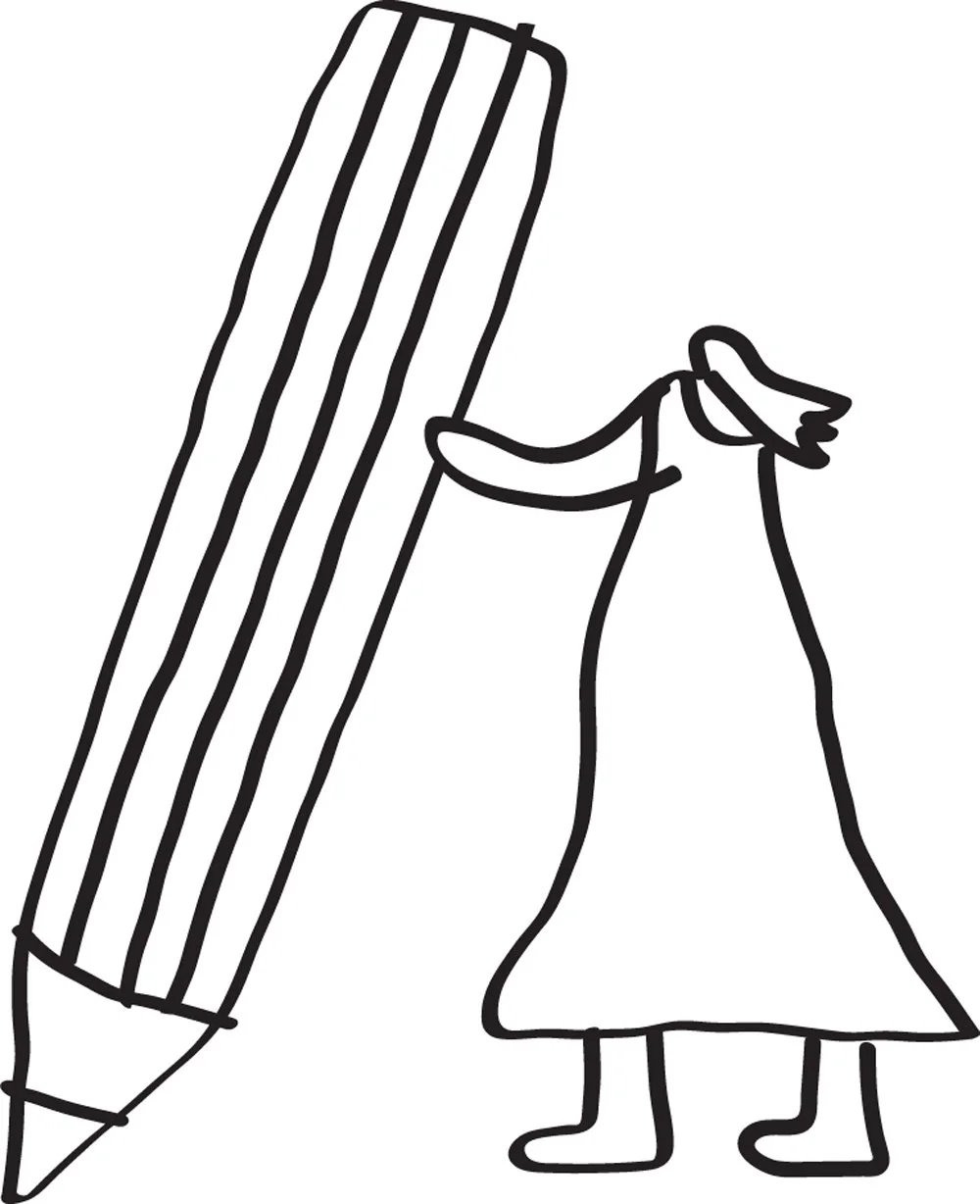
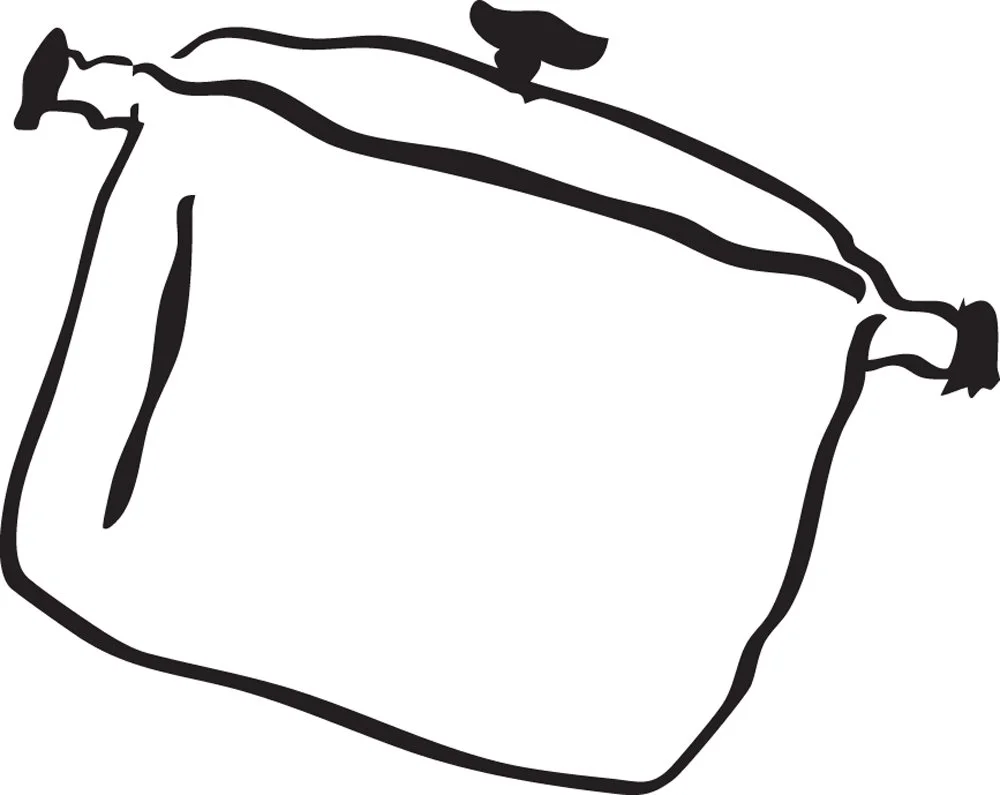
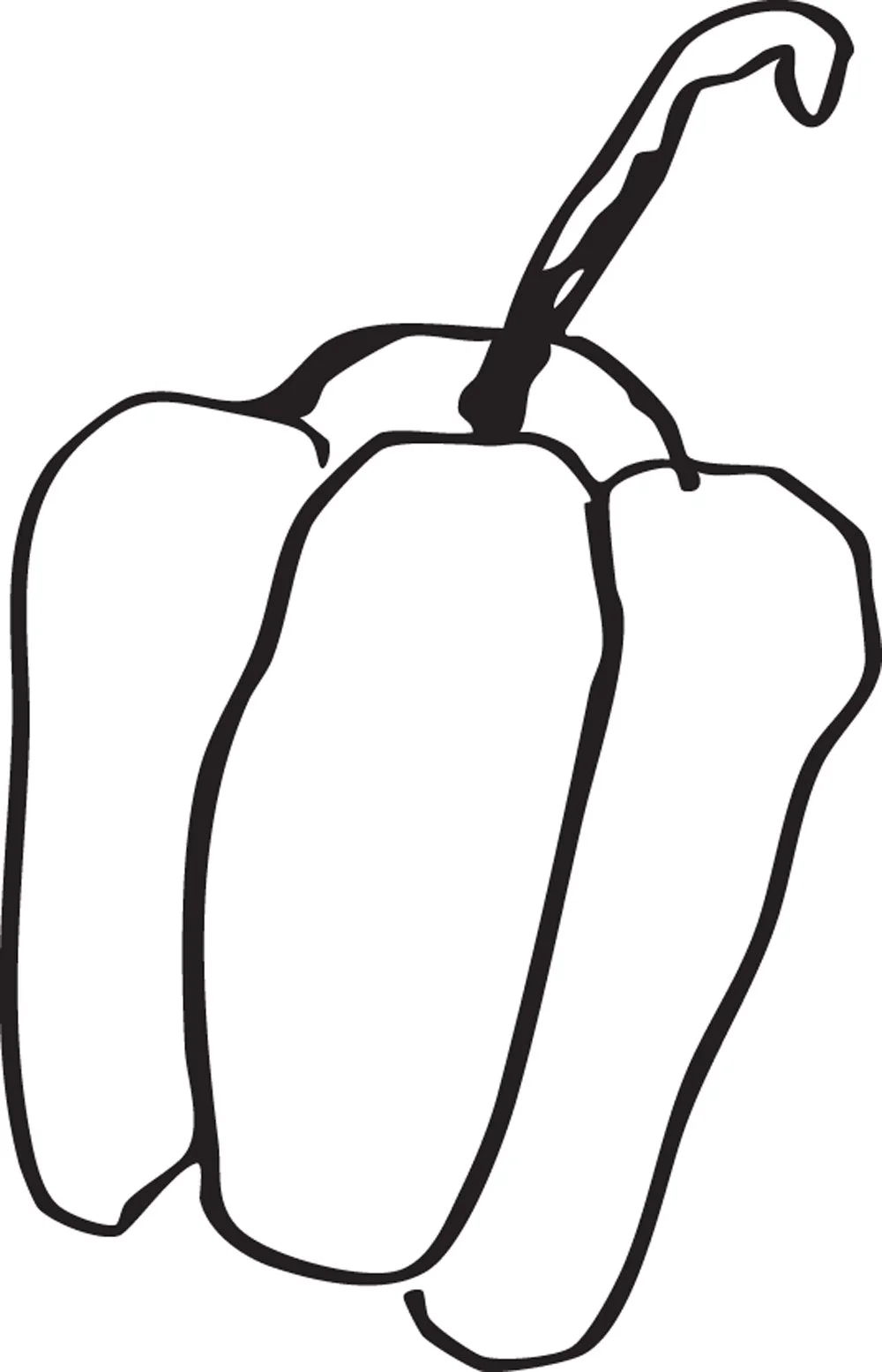
Stepping onto the heritage site, the design team was inspired by the striking contrast between the heritage architecture, the quiet lawn, and the lively energy of modern community life taking root within it. The experience felt remarkably like doodling over a cherished vintage photograph—gently layering colourful, modern dreams over a backdrop of deep history. This sparked a visual identity defined by an expressive, hand-drawn style. Utilising a mix of delicate line drawings and bold silhouette doodle assets, the design infuses every piece of communication with warmth, human touch, and fun.
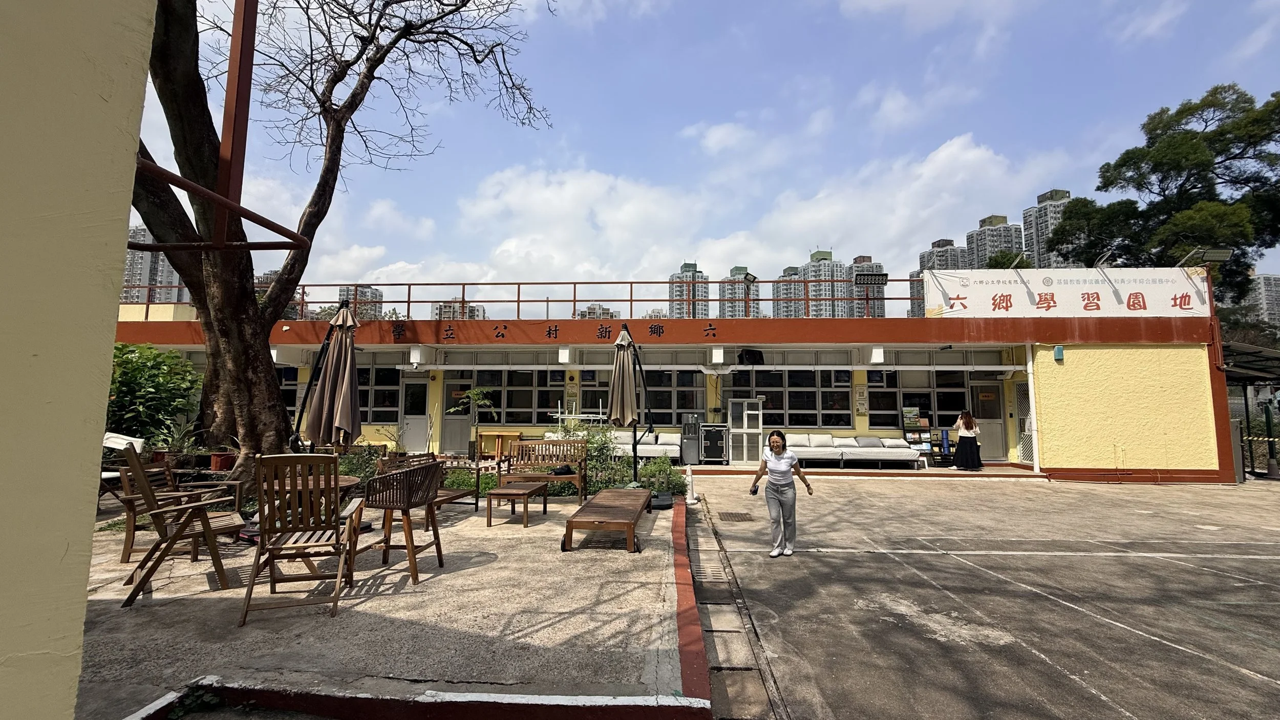
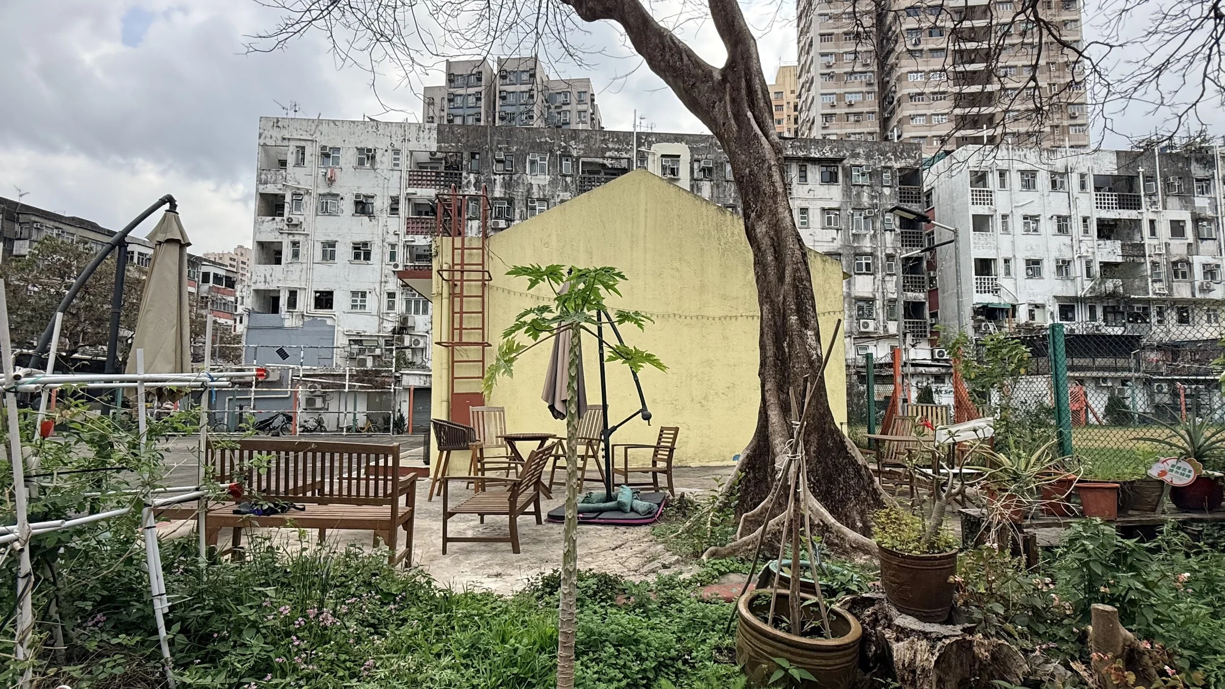
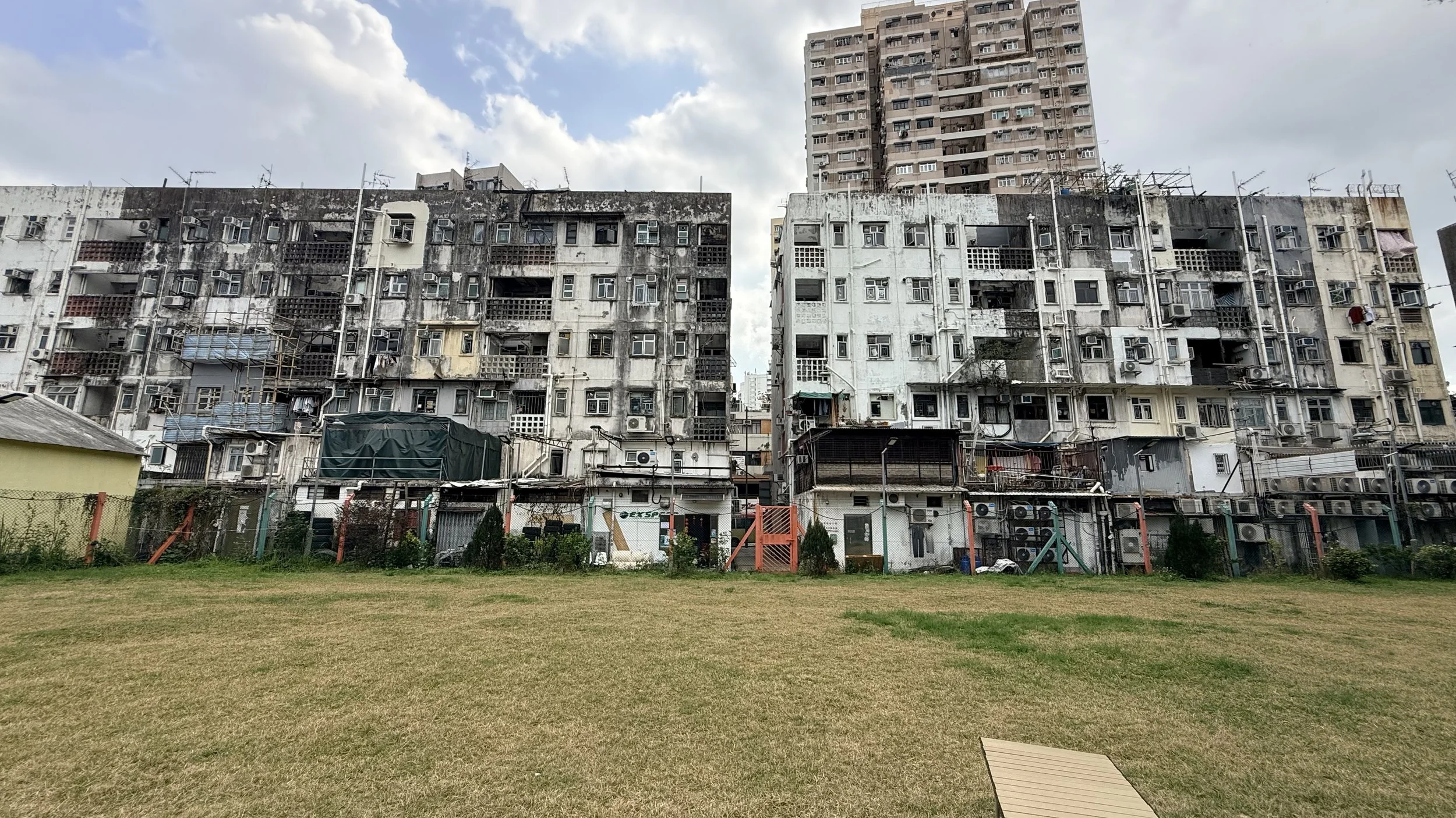
Photos from our graphic designers’ site visit at Luk Heung Commons
A Visual Identity Written by Local Hands
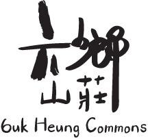
Participation was not merely a brief; it was the creative process itself. To ensure the brand belonged to the community, the designers invited different people to handwrite the name of the hub, ultimately selecting one of them to form the main logotype.
This collective voice flows seamlessly across a comprehensive suite of physical and digital deliverables tailored for everyday connection. At its core, a versatile library of custom line and silhouette doodle graphic assets layers over photography and print materials to inject playfulness and personality. On-site, bespoke environmental signage and activity boards with a consistent style guides visitors while softening the historic architecture with a friendly, accessible tone. In the digital realm, a modular framework of social media templates allows the client to share cohesive, eye-catching stories. Across every flyer, noticeboard, and screen, these scattered doodles act as collective sketches of the neighbourhood's shared imagination.

Built to Evolve
Rather than locking the Commons into a rigid set of static rules, the design framework functions as an open-ended toolkit. The client team can continue drawing their own doodles and expanding the visual assets over time, ensuring the brand remains as dynamic, evolving, and human as the community it serves.
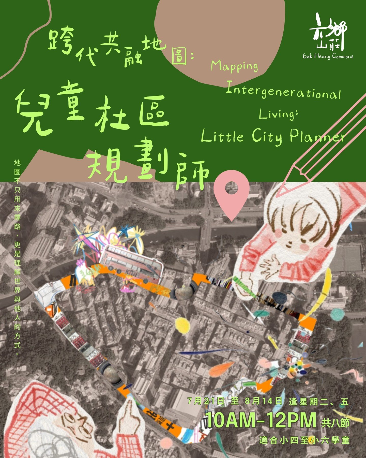

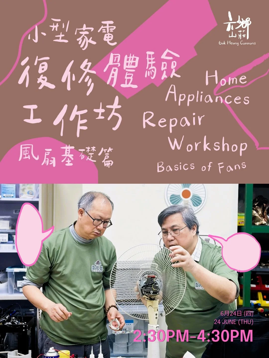
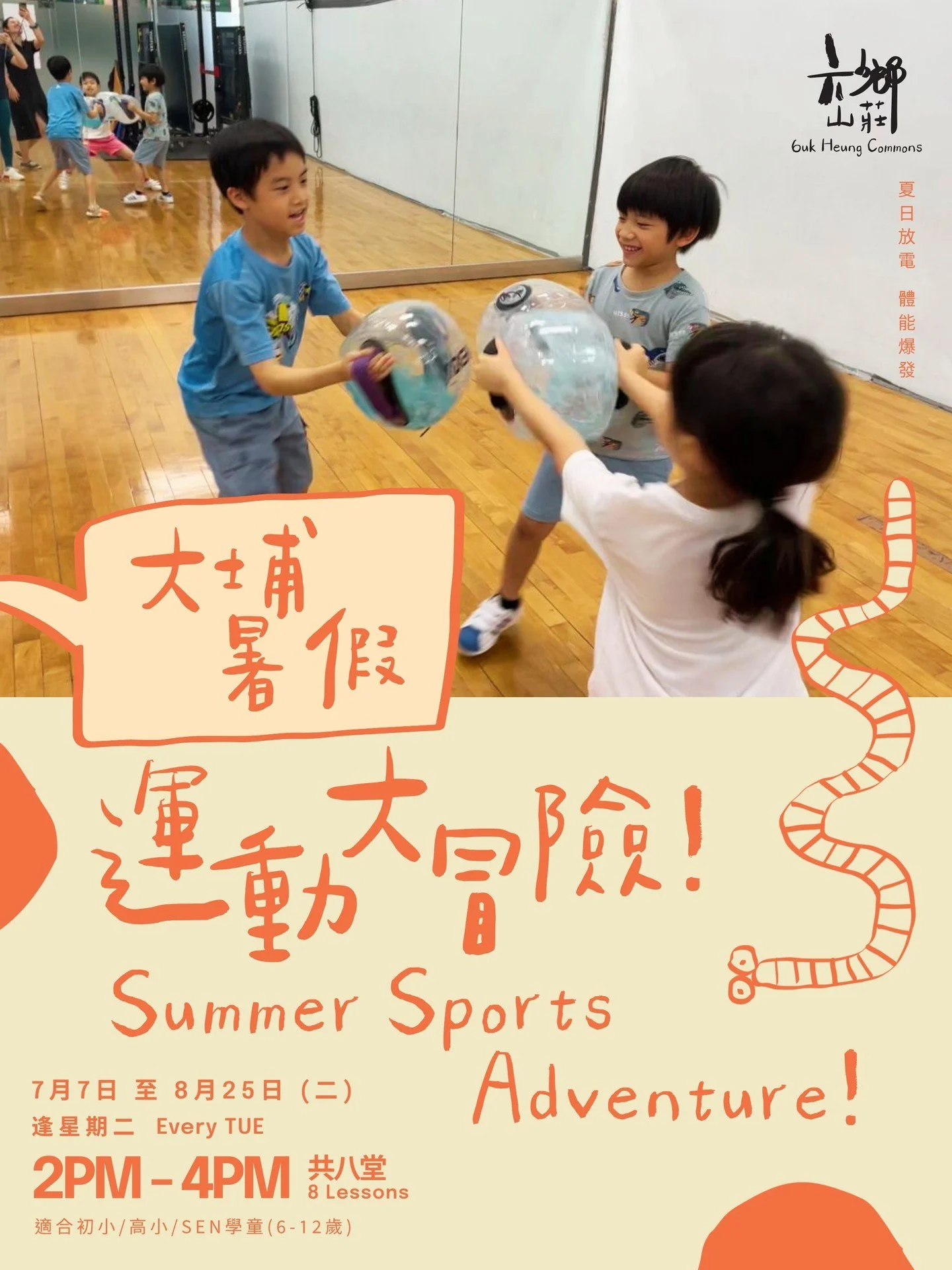

-
By adaptively reusing a quiet village school, Luk Heung Commons breathes new vitality into local heritage, reinventing the site as a vibrant space for civic engagement. The hub fosters long-term positive impact across arts, culture, and community well-being.
-
Team: Alan Cheung, Sarah Mui, Katie Ng, Kevin Tang
-
LukHeungCommons, HappyAgeingLab, BrandIdentity, IdentityDesign, VisualIdentity, GraphicDesign