
by One Bite Design Studio and Leigei Stone for Clerkenwell Design Week 2026
How do you perceive the world?
For most, colour is an unspoken navigator. But for some, it can be an intangible barrier.
In the UK, over 3 million people live with Colour Vision Deficiency (CVD)—approximately 1 in 12 men and 1 in 200 women. Despite this prevalence, our urban and digital environments often rely on colour-coded systems that create unintentional exclusion.
True design excellence doesn’t just cater to the majority;
it acknowledges that every version of the spectrum is a valid way to inhabit the world.

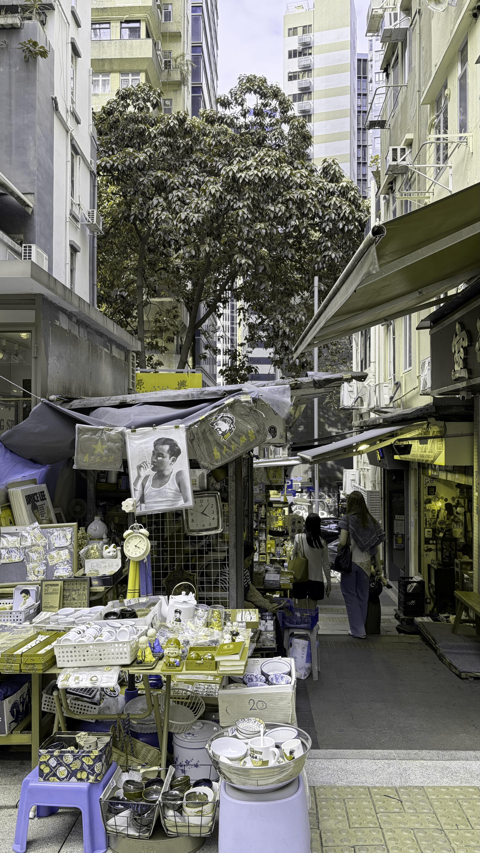
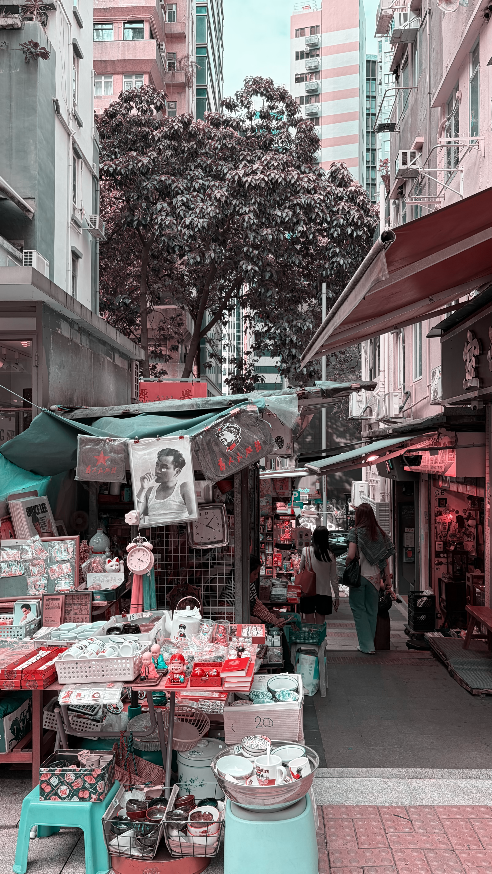
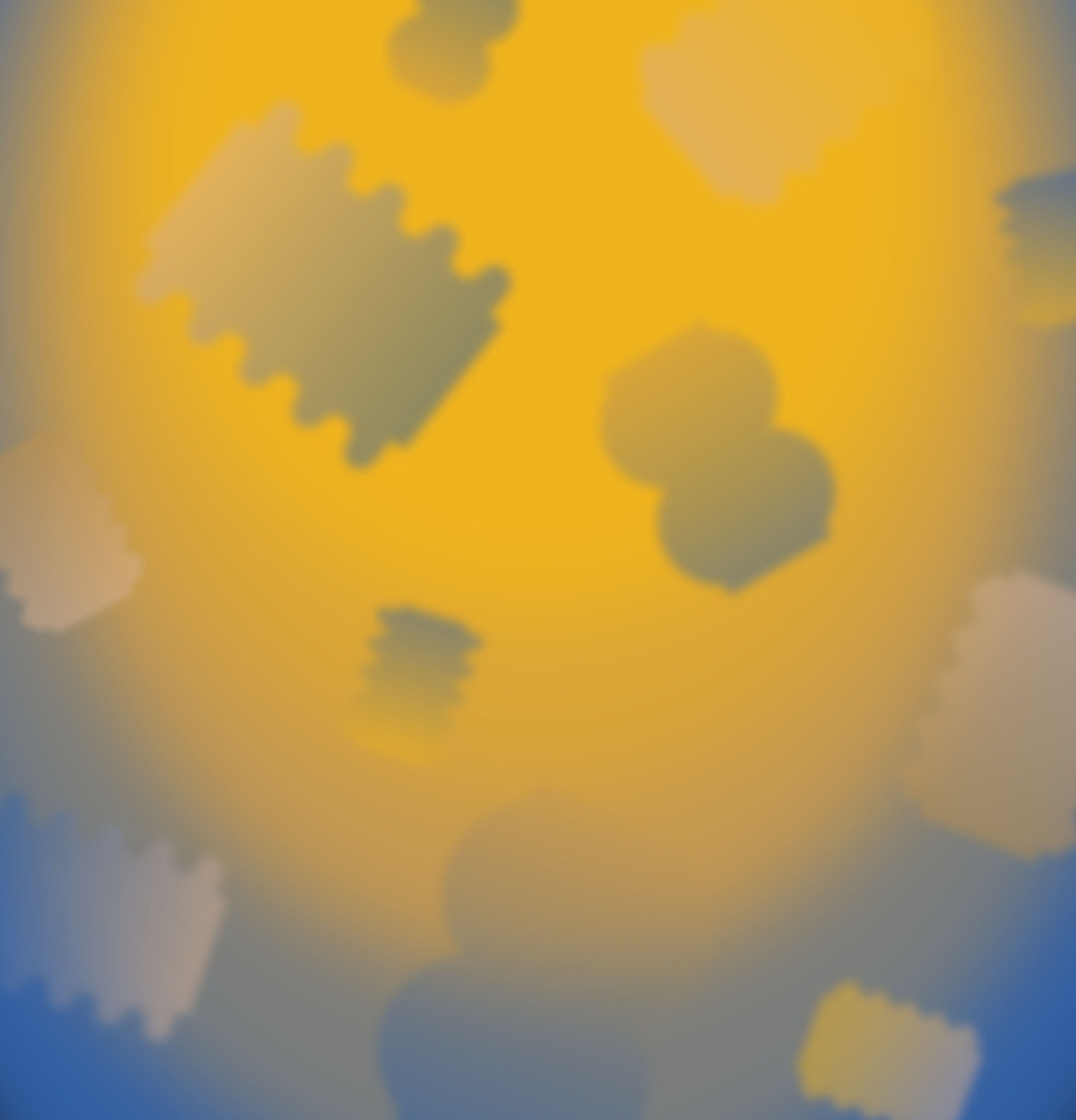
The Multiverse of Vision
Each lens represents a unique way of processing light:
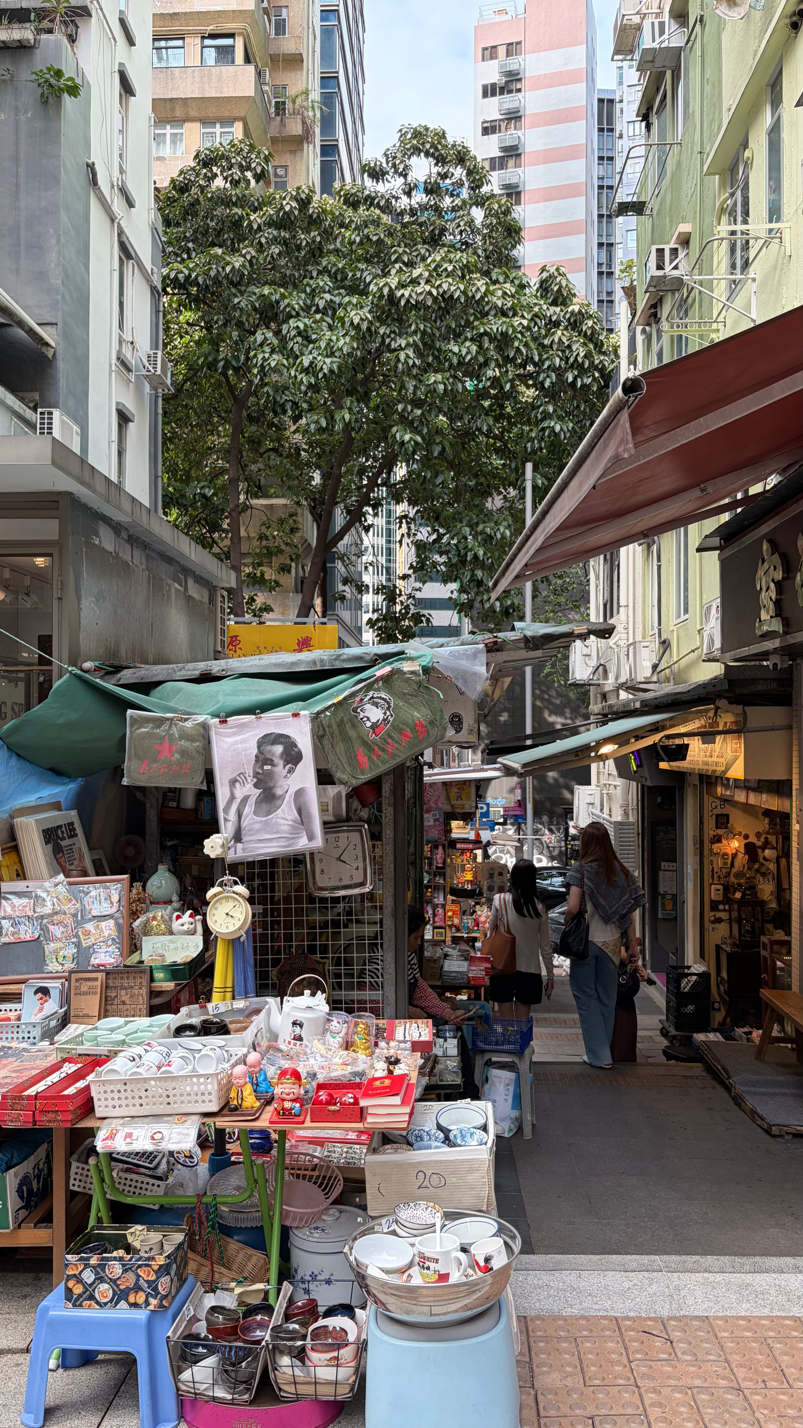
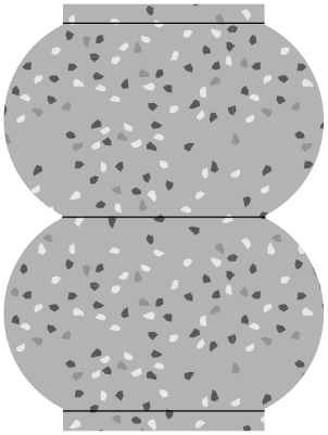
TRICHROMACY

Normal colour vision. Full function of all three cone types (red, green, and blue) allowing typical perception of the full colour spectrum.
The Full-Spectrum World
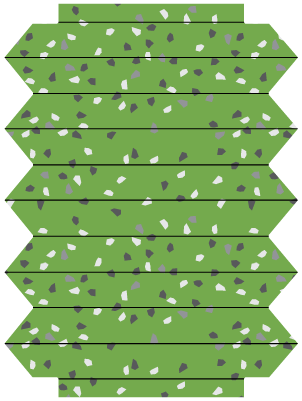
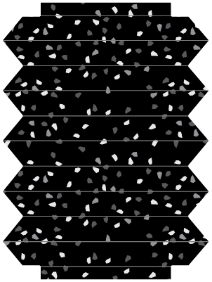
PROTANOPIA

Reduced sensitivity to red light. Reds often appear as dark brown or grey, while greens and oranges shift toward yellow.
The Red-faded World

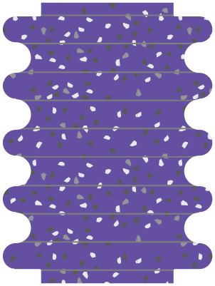
DEUTERANOPIA

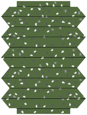
A common red-green deficiency. Greens can look beige or tan, while reds appear more brownish-yellow. Affects roughly 1 in 12 men.
The Green-muted World
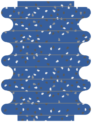
TRITANOPIA

A rare blue-yellow deficiency. Blues appear greenish or grey, while yellows shift toward light grey or violet.
The Blue-shifted World
To bridge the colour gap and speak a universal language of form, follow these proven principles:
The Designer’s Checklist
Move Beyond ‘Colour-Only’ Systems
Never rely solely on a hue to convey vital information. If a green button means "Go" and a red one means "Stop," a significant portion of your audience sees two buttons of the same muddy yellow.
1
The Fix:
Supplement colour with icons, text labels, or distinct patterns. If colour is your only signal, your message is muted for millions.
Prioritise High Contrast Ratios
The Web Content Accessibility Guidelines (WCAG) are the gold standard for a reason. Aim for a 7:1 contrast ratio for text and critical UI elements.
2
The Logic:
High contrast ensures that even if specific hues blur or merge, the luminosity (the difference in brightness) keeps the content distinct.
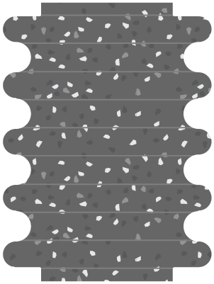
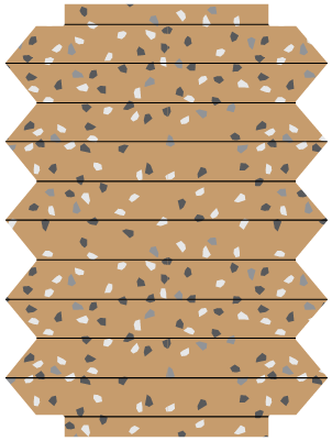
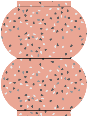
Integrate Tactile & Structural Design
Texture is a universal language. In our Clerkenwell Green installation, we utilised the sculptural stacks of Leigei Stone to provide physical differentiation.
3
The Fix:
In physical environments, use tactile surfaces, embossed signage, or varied material finishes. If a user can feel the difference, they don’t need to see the colour.
Ensure Chromatic Precision
When a design requires specific visual triggers—such as an optical test or a wayfinding map—precision is non-negotiable.
4
The Logic:
Use materials like reconstituted stone or high-grade pigments that offer absolute chromatic consistency. This ensures that the "visual test" you intended remains reliable under any lighting condition.
Validate with Inclusive Testing
Don’t guess—simulate. Use CVD simulators (like Sim Daltonism or Adobe’s built-in filters) during the drafting phase.
5
The Fix:
Engage in co-creation. Facilitate workshops with users who have diverse visual needs to stress-test your design before it reaches the public.

To ensure universal legibility, avoid placing these colour combinations against one another:
The Conflict Palette

Blue & Grey
Common in Tritanopia; blue loses its saturation.

Green & Brown
These often merge into a single muddy earth tone.
Pink & Grey
Pink can disappear into a neutral grey.
The most common point of confusion for Red-Green CVD.

Red & Green
Blue often looks identical to purple when red receptors are weak.
Blue & Purple
Low-saturation greens often lack the contrast to stand out from black.
Green & Black

Essential tools to use when designing:
The Vision Toolkit
Coloring for Colorblindness | David Nicolas
An interactive simulator to select and test colour palettes against various types of CVD, ensuring your designs remain distinct and accessible beyond "colour-only" systems.
Color Blindness Simulator | Coblis
A professional-grade tool that allows you to upload your own design files and renders. By simulating various visual deficiencies, you can identify "invisible barriers" in your layouts.
Color Contrast Analyzer | Adobe
A professional tool for meeting the WCAG accessibility standards. Use it to ensure your text and background elements achieve the 7:1 contrast ratio required for enhanced accessibility.