

Brown Table Culture Branding Revamp | Hong Kong
-
Category: Interior & Product, Story-telling & Communications
Type: Interior | Branding
Location: Hong Kong
Client: Brown Table Culture
Completion: 2023
Brown Table Culture Branding Revamp
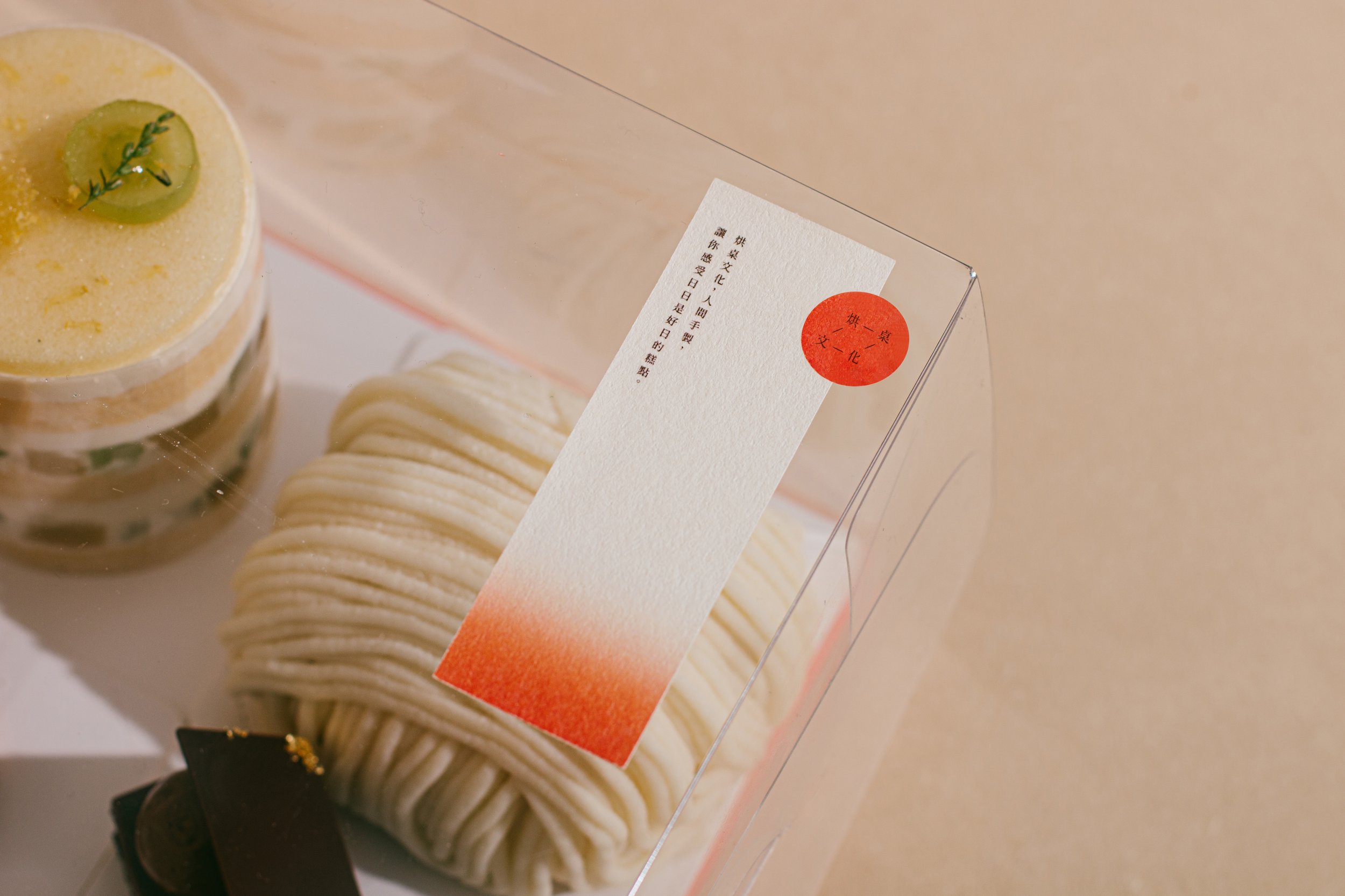
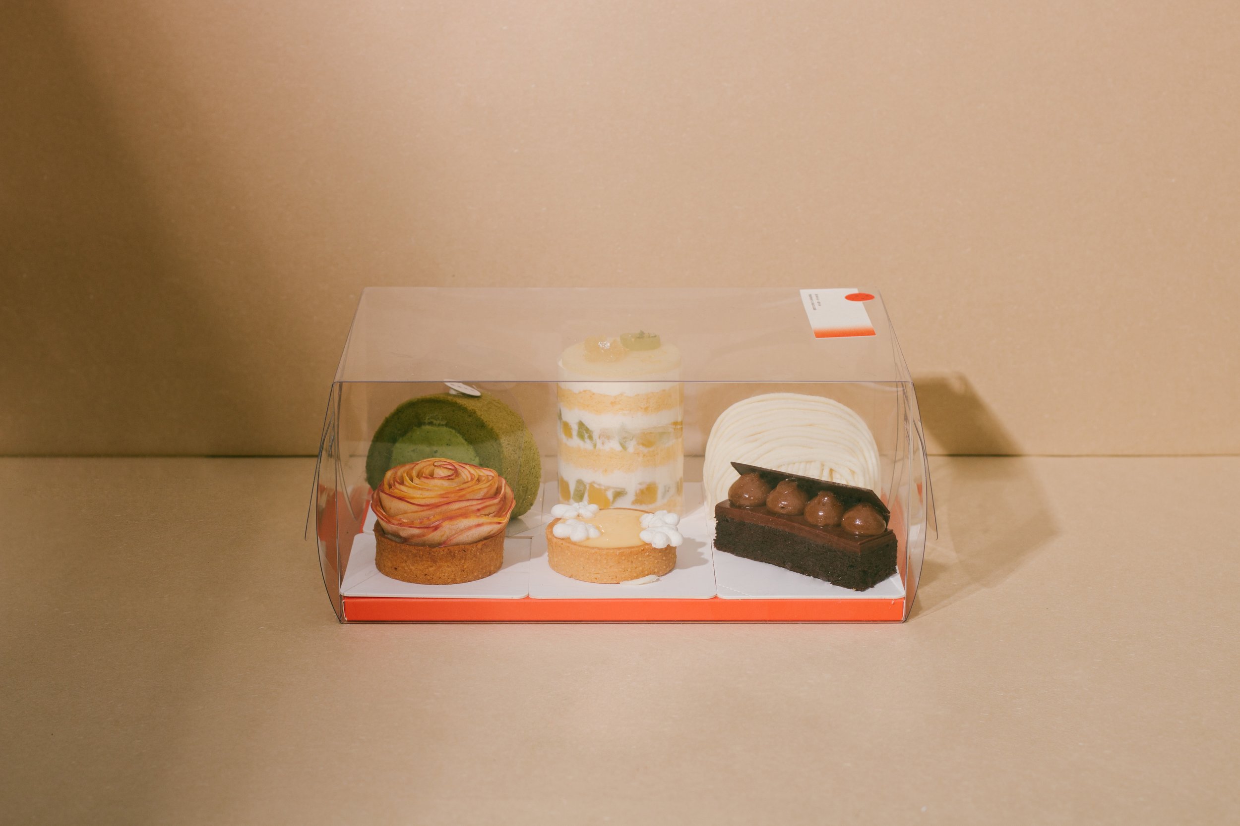
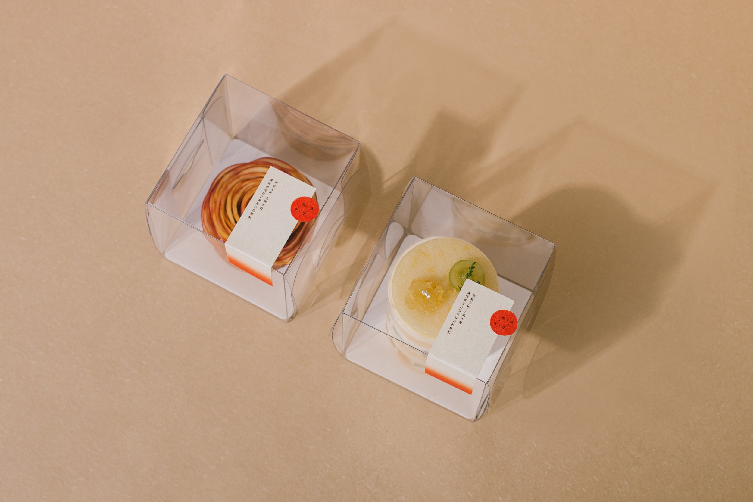
onebite was commissioned by Brown Table Culture's (BTC) to interpret their business concept and baking ethos as visual branding elements.
BTC, an online-only bakery, is known for making desserts that are both delicious and healthy. With many years of experience working in famous patisseries, BTC’s pastry chefs make light fluffy cakes with refreshing and natural ingredients such that everyone can enjoy a variety of desserts without the guilt and burden to their health. They have three key principles, namely: their attention to the taste by using organic fruits and nuts; their attention to health by using less gelatin and processed sugar to bring out the natural flavour of the products; and their attention to the ingredients’ place of origins by being transparent about the place of origins of their fresh fruits and organic ingredients, be it whether they are imported or bought from local farms.
These principles are reflected in the honesty of BTC’s products: they make their purees by hand, and try to highlight the natural taste of their ingredients as much as possible.
As no artificial colouring is added to the dessert, the light colour of the product reflects the colour of the natural ingredients accurately. BTC also wants customers to take every bite with a sense of warmth as the sweet taste is a harmonious blend of natural ingredients and unrefined sugar, not artificial sweeteners.
In designing BTC’s visual identity, we attempt to reflect the attention to their craft, their honesty, and the sense of warmth they hope customers will feel.
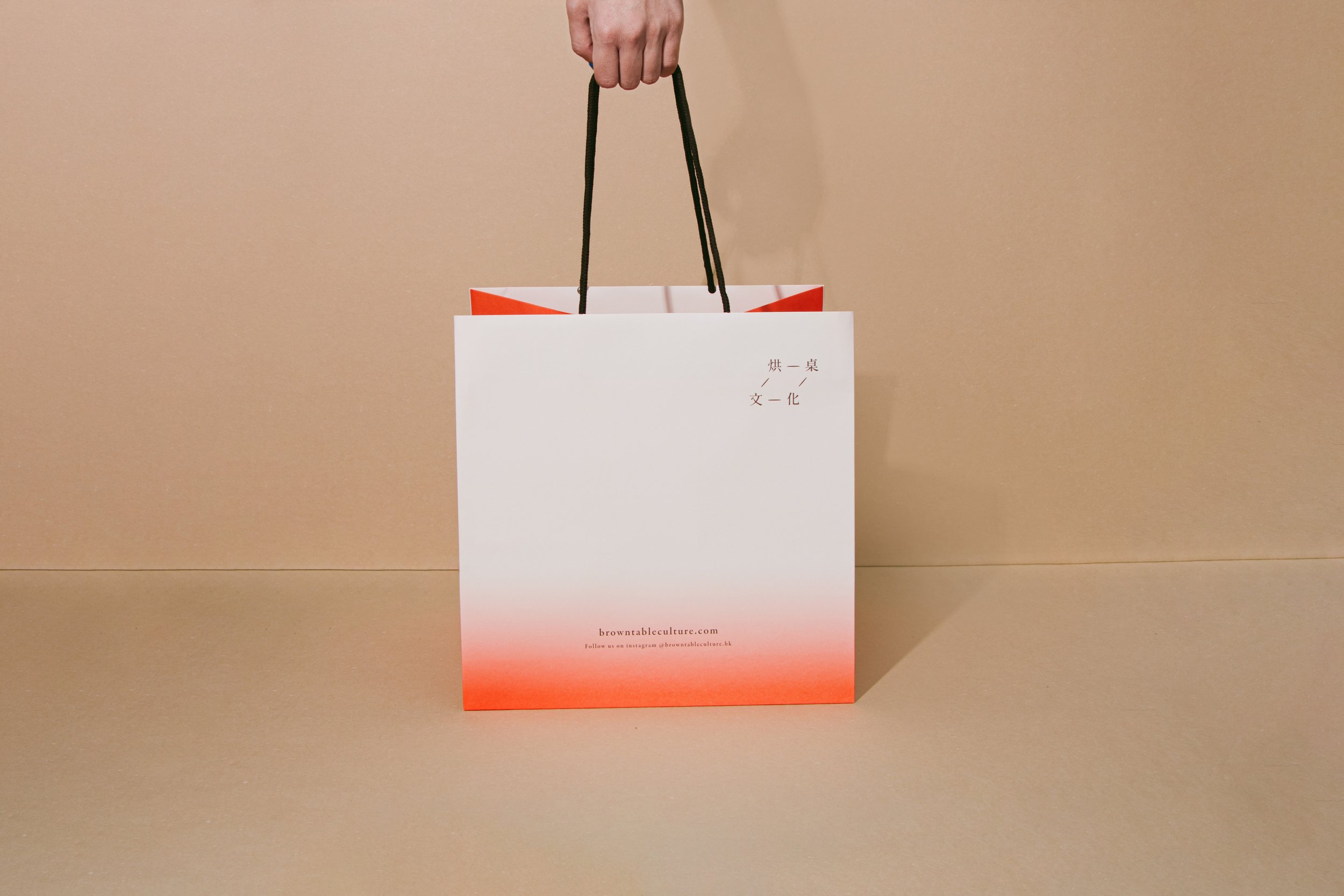
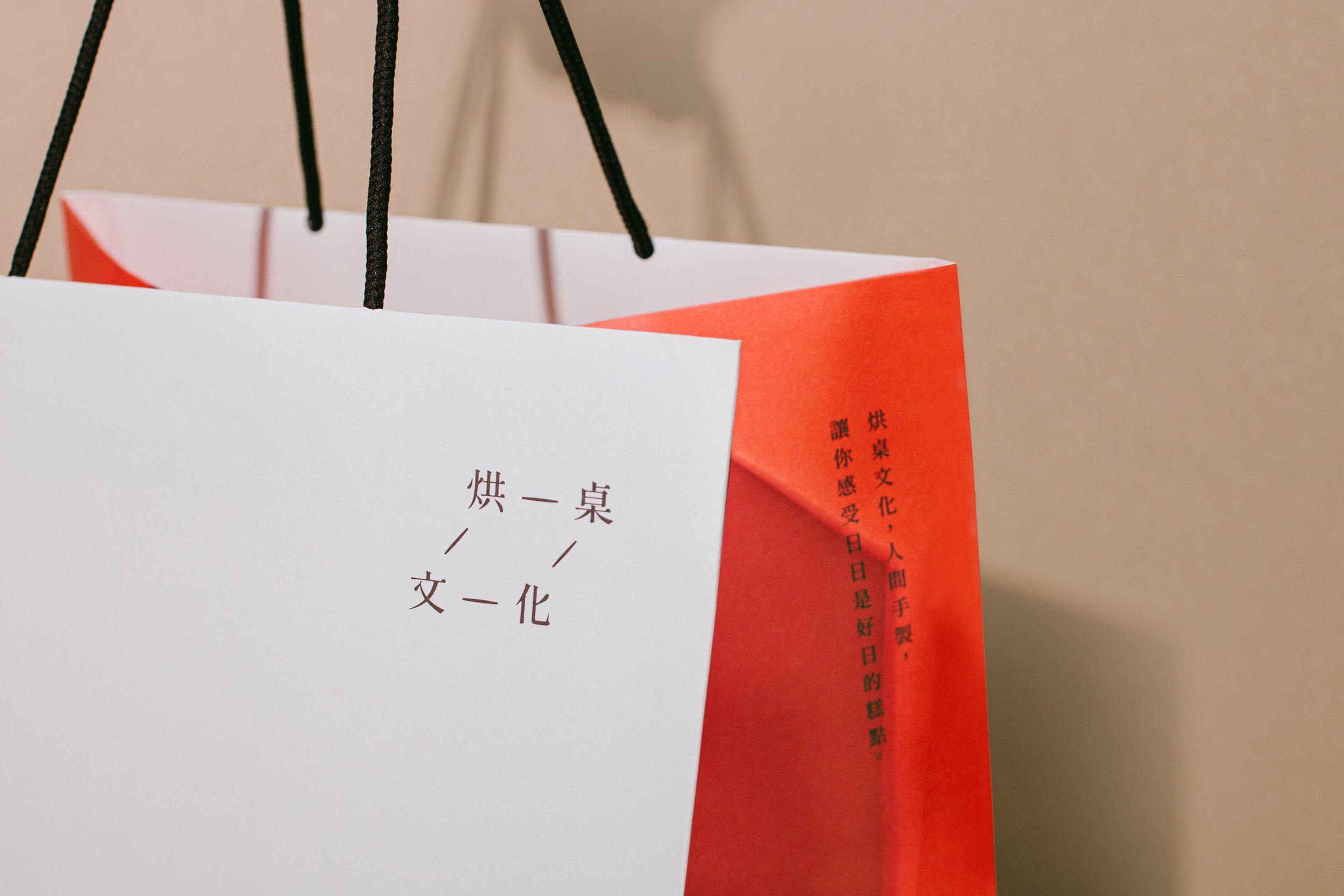
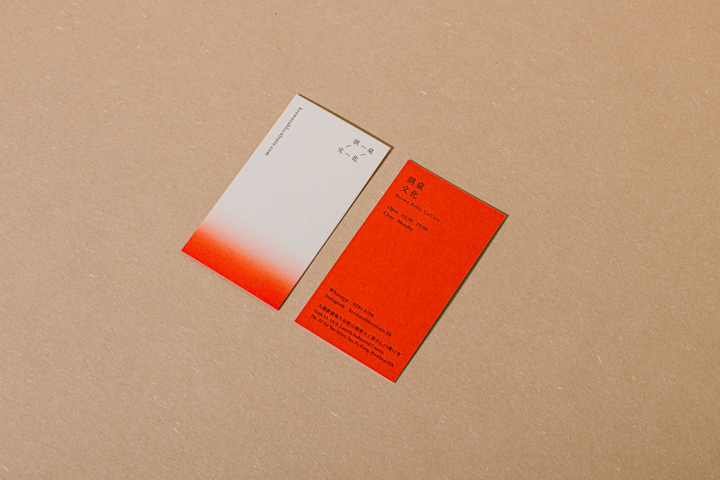
Firstly, we used lines to represent the geometry of the table and to conceptualise the meaning of BTC’s name visually as a logo. Used on name cards, stickers and paper bags, the logo is not only designed as a graphic but also intended to have a tactile “pressed-on” quality that simulates the branding iron mark on a cheesecake. When one’s finger touches the card, there is a subtle but noticeable embossed texture.
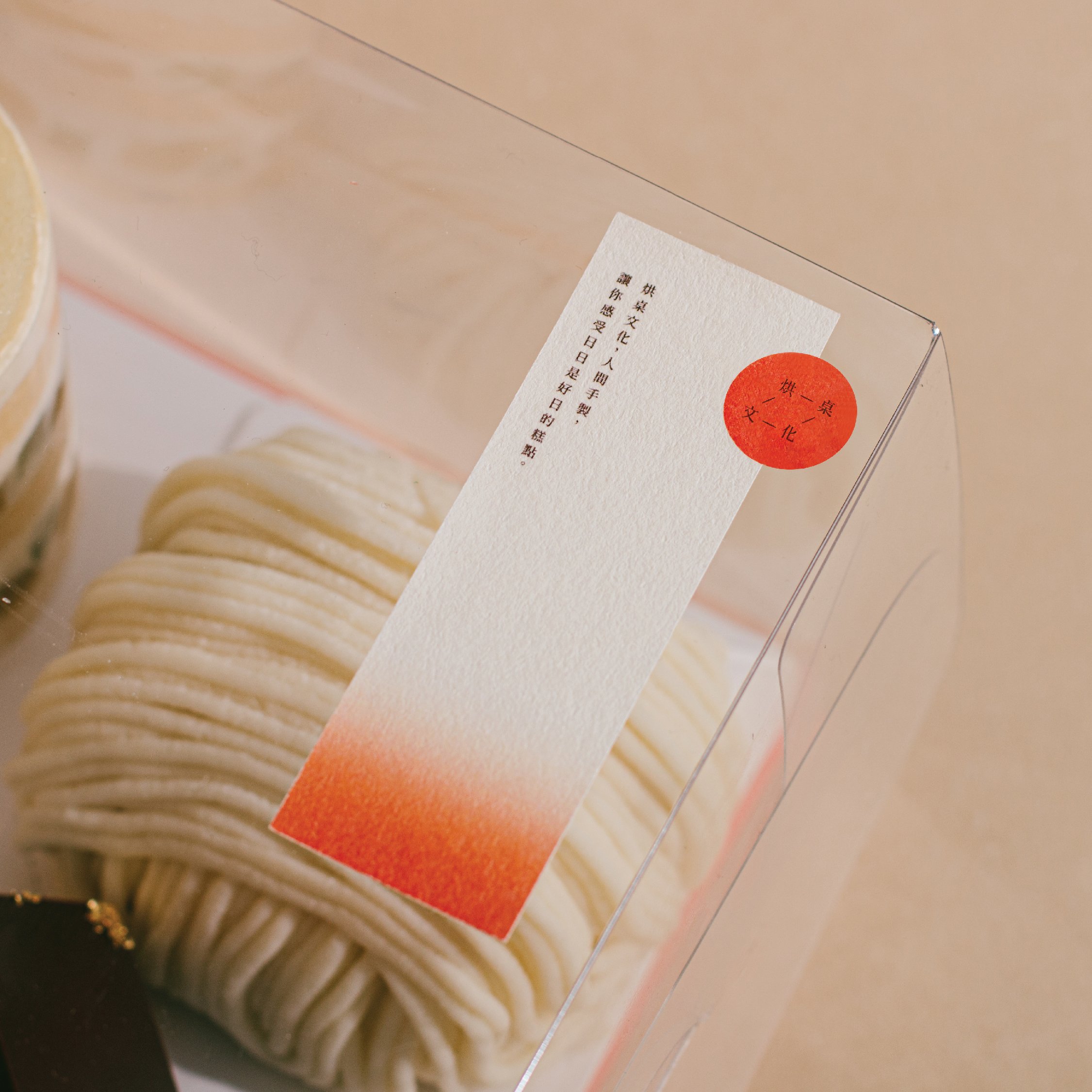
In addition, we designed the cake box to be transparent with a description label and logo to the side which do not overwhelm the product. The clear packaging emphasises the visual importance of the delicately crafted cake: when the customer holds up the dessert box, they can see the beautiful and colourful dessert presented like a piece of precious jewellery directly.
Another key element of the brand design is the use of a bright, vibrant red colour which gradually turns into white. The gradient effect visualises the identity of BTC as a pâtisserie, where each piece of dessert is created by passing through the glow of a magical warm red shade as they are baked to perfection in the oven.
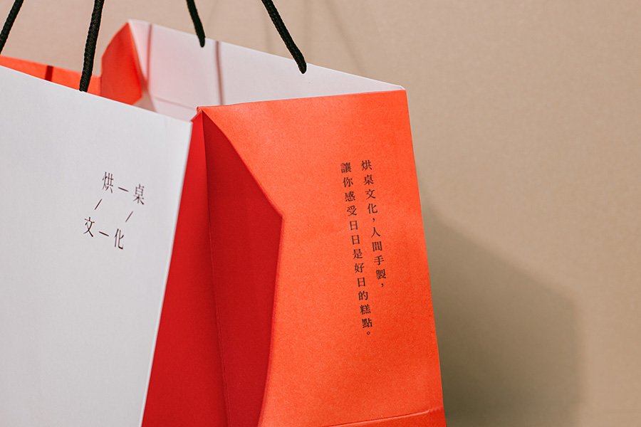
Honesty, Craftsmanship, and the Warmth of Cake
-
Dessert is an indispensable seasoning in life. Yet sweetness can be a bane for urban dwellers who overdose on and suffer from chronic diseases such as diabetes and hypertension as a result of excessive sugar intake. However, enjoying good desserts does not necessarily mean taking in excessive sugar; if the amount of sugar in the ingredients can be moderated, a dessert can be both healthy and delicious.
onebite is heartened to support Brown Table Culture’s (BTC) mission to make delicious and healthy desserts, and their principles of prioritising the use of local or sustainable organic ingredients, and carefully tracking the origin of each ingredient used in the dessert to take stock of its carbon footprint and minimise negative impact to the environment. These principles inspire and form the key concept for the branding design.
Design for Good ValuesPositive Impact
ESG/ Sustainability Factors
Customers
- Health & Wellness
- Support for Purpose Driven Enterprises
-
-
Photographer: Brenda Hui
One Biters: Alan Cheung, Brenda Hui, Sarah Mui
-
#brandingrevamp #baking #hongkong #localorganic #cake #dessert